Do the dates and mints on silver quarters properly reflect their mintage?
Preamble
Washington quarters have been produced almost continuously from 1932 until present day. From 1932 until 1964 their composition was 90% silver and 10% copper; in 1965 the composition was changed to a copper core, which was clad on the obverse and reverse with CuNi (this is why there’s a strip of copper on the edge of the quarters you have in your pocket; you’re seeing the copper core). Due to the value of their silver content, pre-65 quarters are commonly collected and held by collectors.
This past week I was able to access a semi-random assortment of pre-1965 Washington quarters; I thought it would be neat to compare the dates and mints-of-origin with what we’d expect given the mintage numbers provided by the United States Mint and maybe explore some trends within the dataset.
Data
This link can be used to access the raw data and the R code I used can be found below.
Here is the raw data I am working with. “P” designates the Philadelphia mintmark; “D” the Denver mint; “S” the San Francisco mint. No prefix indicates official mintage numbers, while “obs.” indicates my observed frequencies in the small (290 quarters) sample I had access to.
| Year | P | D | S | Proof | obs.P | obs.D | obs.S |
|---|---|---|---|---|---|---|---|
| 1932 | 5404000 | 436800 | 408000 | 0 | 0 | 0 | |
| 1933 | |||||||
| 1934 | 31912052 | 3527200 | 2 | 0 | |||
| 1935 | 32484000 | 5780000 | 5660000 | 1 | 0 | 0 | |
| 1936 | 41300000 | 5374000 | 3828000 | 3837 | 3 | 0 | 0 |
| 1937 | 19696000 | 7189600 | 1652000 | 5542 | 2 | 0 | 0 |
| 1938 | 9472000 | 2832000 | 8045 | 1 | 0 | ||
| 1939 | 33540000 | 7092000 | 2628000 | 8795 | 2 | 1 | 2 |
| 1940 | 35704000 | 2797600 | 8244000 | 11246 | 4 | 0 | 1 |
| 1941 | 79032000 | 16714800 | 16080000 | 15287 | 2 | 1 | 1 |
| 1942 | 102096000 | 17487200 | 19384000 | 21123 | 10 | 1 | 0 |
| 1943 | 99700000 | 16095600 | 21700000 | 5 | 0 | 1 | |
| 1944 | 104956000 | 14600800 | 12560000 | 6 | 0 | 0 | |
| 1945 | 74372000 | 12341600 | 17004001 | 3 | 0 | 0 | |
| 1946 | 53436000 | 9072800 | 4204000 | 2 | 0 | 0 | |
| 1947 | 22556000 | 15338400 | 5532000 | 1 | 4 | 1 | |
| 1948 | 35196000 | 16766800 | 15960000 | 2 | 1 | 3 | |
| 1949 | 9312000 | 10068400 | 0 | 0 | |||
| 1950 | 24920126 | 21075600 | 10284004 | 51386 | 1 | 2 | 2 |
| 1951 | 43448102 | 35354800 | 9048000 | 57500 | 3 | 4 | 3 |
| 1952 | 38780093 | 49795200 | 13707800 | 81980 | 4 | 4 | 0 |
| 1953 | 18536120 | 56112400 | 14016000 | 128800 | 3 | 9 | 3 |
| 1954 | 54412203 | 42305500 | 11834722 | 233300 | 3 | 3 | 0 |
| 1955 | 18180181 | 3182400 | 378200 | 3 | 0 | ||
| 1956 | 44144000 | 32334500 | 669384 | 1 | 3 | ||
| 1957 | 46532000 | 77924160 | 1247952 | 3 | 10 | ||
| 1958 | 6360000 | 78124900 | 875652 | 0 | 5 | ||
| 1959 | 24384000 | 62054232 | 1149291 | 0 | 3 | ||
| 1960 | 29164000 | 63000324 | 1691602 | 0 | 7 | ||
| 1961 | 37036000 | 83656928 | 3028244 | 2 | 11 | ||
| 1962 | 36156000 | 127554756 | 3218019 | 5 | 8 | ||
| 1963 | 74316000 | 135288184 | 3075645 | 9 | 7 | ||
| 1964 | 560390585 | 704135528 | 3950762 | 56 | 50 |
Results & Discussion
Loading Data
Let’s go ahead and prepare our environment and load our data.
1
2
3
4
5
6
7
8
9
10
11
12
13

#--------------------
library(ggplot2)
library(reshape2)
library(gridExtra)
library(magrittr)

###
# read data
###
dat.orig<-dat<-read.csv(file.path(getwd(),"QuartData.txt"),sep="\t",header=TRUE)
dat
str(dat)
Data Prep
We’ll start by removing the Proof mintage numbers. We’ll be ignoring the Proof mintage numbers for this analysis for two reasons:
- they’re exceedingly small in magnitude compared to the other categories
- and more importantly, because they were Proofs, we don’t expect them to be in general circulation when these coins were being issued, and therefore we really don’t expect them to appear in the junk silver market.
We follow up by substituting zeros for NA’s in the dataset (Don’t worry, we won’t forget about those NA values when carrying out tests.), calculate the total number of quarters produced by the mint (per year and in total) and the observed (yearly and total) sums. We then convert all of the counts to fractions/proportions to make the values easier to compare. Finally we split and “melt” the data to make it ggplot friendly.
1
2
3
4
5
6
7
8
9
10
11
12
13
14
15
16
17
18
19
20
21
22
23
24
25
26
27
28
29
30
31
32
33
34
35
36
37
38
39
40
41
42
43
44
45
46
47
48
49
50

#--------------------
###
# restructure & prepare data for ggplot
###
# remove proof numbers; they're inconsequential...
dat<-dat[,-c(5)]

# add zero's for NA values to make math operations easier
dat[is.na(dat)]<-0

# calculate total mintage by year
dat$mintYearSum<-dat$P + dat$D + dat$S

# calculate total observed by year
dat$obsYearSum<-dat$obs.P + dat$obs.D +dat$obs.S

# how many total (non-proof) quarters minted?
totalMintage<-sum(dat$mintYearSum)

# how many total observations?
totalObs<-sum(dat$obsYearSum)

# we will be working with proportions...
# so let's calculate them:
dat$MintP<-dat$P/totalMintage
dat$MintD<-dat$D/totalMintage
dat$MintS<-dat$S/totalMintage
dat$ObsP<-dat$obs.P/totalObs
dat$ObsD<-dat$obs.D/totalObs
dat$ObsS<-dat$obs.S/totalObs
dat$YearMintage<-dat$mintYearSum/totalMintage
dat$YearObs<-dat$obsYearSum/totalObs

# and let's break the data up into two dataframes, one for mintage and one for observed values.
str(dat)
mdat<-dat[,c(1,10:12)]
odat<-dat[,c(1,13:15)]

# and let's do some voodoo to make the visualization easier later on...
# you'll see where I'm going with this...
odat$ObsS<-odat$ObsS
odat$ObsD<-odat$ObsD + odat$ObsS
odat$ObsP<-odat$ObsP + odat$ObsD

# melt data for ggplot
mdat<-melt(mdat,id.vars="Year")
mdat
odat<-melt(odat,id.vars="Year")
odat
Yearly mintage
Looking at the mintage number per year, we can see that the number in 1964 absolutely dwarfs all of the other years. This is due to the hoarding of silver coins by the American public in response to the upcoming changes in quarter (and dime) composition.
1
2
3
4
5
6
7
8
9

ggplot() +
  theme_bw() +
  ylab("Fraction") +
  geom_bar(data=mdat,
           aes(x=Year, y=value, fill=variable),
           stat="identity",
           alpha=0.5
           )
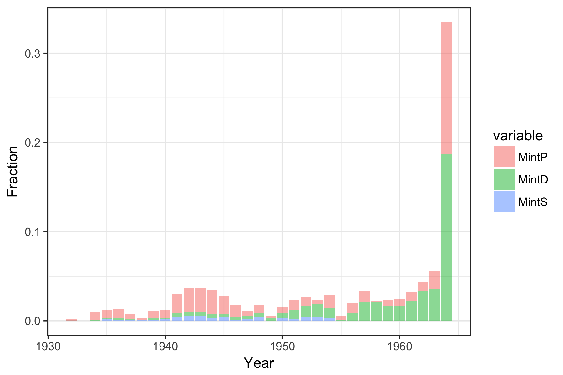
Observed date frequencies
When we overlay our observed frequencies on the mintage numbers, there seems to be a nice degree of correspondence.
1
2
3
4
5
6
7
8
9
10
11
12
13
14
15
16
17

ggplot() +
  theme_bw() +
  ylab("Fraction") +
  geom_bar(data=mdat,
           aes(x=Year, y=value, fill=variable),
           stat="identity",
           alpha=0.5
           ) +
  geom_line(data=odat,
            aes(x=Year, y=value, color= variable),
            alpha=1, size=1
            ) +
  geom_point(data=odat,
            aes(x=Year, y=value, shape=variable),
            colour= "black",
            size=1)

Distribution goodness of fit
We should ask ourselves “how well does our observed distribution fit our assumed parent distribution”, i.e. is the distribution of our observed data fit our expectations that mintage counts govern the availability of quarters available to collectors. We can test this using a Chi-Square goodness of fit test.
For this test:
- H0: the observed frequency distribution is the same as the hypothesized distribution.
- HA: Observed and hypothesized distributions are different.
1
2
3
4
5
6
7
8
9
10
11
12
13
14
15
16
17
18
19
20
21
22
23
24
25
26
27
28
29

# no production of quarters in 1933, so they must be excluded from the test
dat[-c(2),] %$%
  chisq.test(
    x = obsYearSum,
    p = mintYearSum,
    rescale.p = TRUE
  )
# 	Chi-squared test for given probabilities
#
# data:  obsYearSum
# X-squared = 38.635, df = 31, p-value = 0.1628
#
# Warning message:
# In chisq.test(x = obsYearSum, p = mintYearSum, rescale.p = TRUE) :
#   Chi-squared approximation may be incorrect
cs<-dat[-c(2),] %$%
  chisq.test(
    x = obsYearSum,
    p = mintYearSum,
    rescale.p = TRUE
  )
cs$expected
#  [1]  0.4799033  2.7217091  3.3733316  3.8785173  2.1916672  0.9449384
#  [7]  3.3223369  3.5900285  8.5882179 10.6725811 10.5595633 10.1464753
# [13]  7.9654372  5.1234951  3.3351163  5.2164222  1.4884008  4.3222428
# [19]  6.7468861  7.8552680  6.8093714  8.3367482  1.6406309  5.8734938
# [25]  9.5581436  6.4883796  6.6383941  7.0781538  9.2691301 12.5728684
# [31] 16.0974507 97.1146967
The p-value (0.1628) is above the (arbitrary) significance level of 0.05, indicating that we cannot reject H0. This statement comes with a caveat however: The output indicates that the Chi-Squared approximation may be incorrect. This is due to our low expected counts in each bin. Ideally we’d want all of our expected counts to be much higher. In this specific case, the warning indicates that because our dataset is small, we should interpret these results with caution, and we’d do well to increase our sample size.
Possible influences…
Looking at the previous plot, It appears that dates later than ~1950 have observed counts that are generally consistent with or higher than our expectations based on mintage numbers alone, while later dates might have lower counts. I also notice that the observed counts for the years during WW2 are generally lower than expected.
1
2
3
4
5
6
7
8
9
10
11
12
13
14
15
16
17
18
19
20
21
22

ggplot() +
  theme_bw() +
  ylab("Fraction") +
  geom_bar(data=mdat,
           aes(x=Year, y=value, fill=variable),
           stat="identity",
           alpha=0.5
           ) +
  geom_line(data=odat,
            aes(x=Year, y=value, color= variable),
            alpha=1, size=1
            ) +
  geom_point(data=odat,
            aes(x=Year, y=value, shape=variable),
            colour= "black",
            size=1) +
  geom_vline(xintercept = 1941, colour="brown") +
  geom_vline(xintercept = 1942, colour="brown") +
  geom_vline(xintercept = 1943, colour="brown") +
  geom_vline(xintercept = 1944, colour="brown") +
  geom_vline(xintercept = 1945, colour="brown")
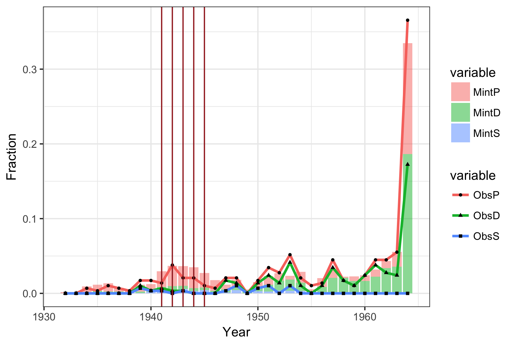
These observations suggest that the distribution may be disturbed by a couple factors.
- The overall age of the coin; older coins are more likely to become lost or worn and removed from circulation by the mint.
- People may remove coins with culturally significant dates from circulation.
- The overall rarity of a coin (a product of mintage, and other factors) can improve its desirability for collection, which would also effect its chances of being removed from circulation.
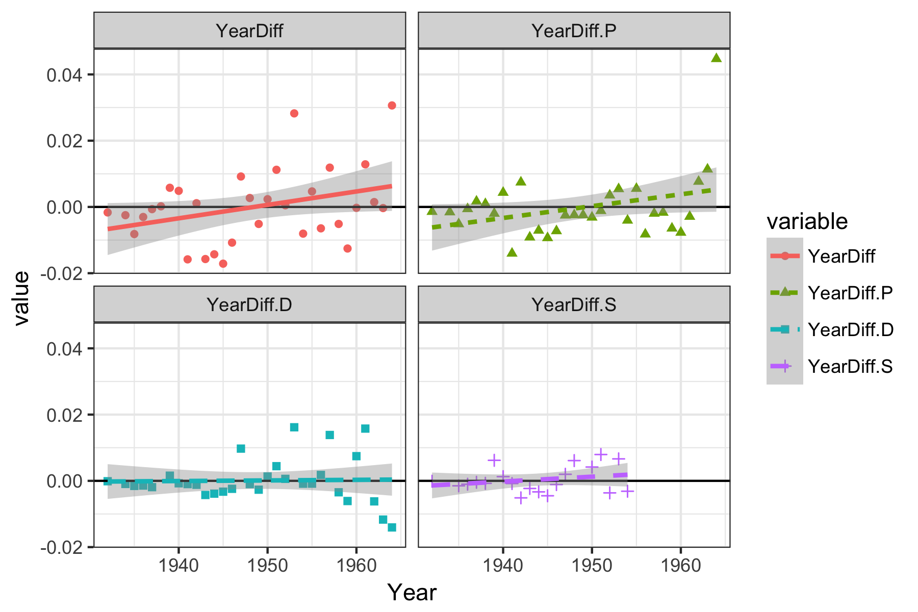
Age is probably the easiest influence to investigate, let’s look at its possible influence.
1
2
3
4
5
6
7
8
9
10
11
12
13
14
15
16
17
18
19
20
21
22
23
24
25
26
27
28
29
30
31
32
33

# let's look at age impact for each mint
# take the differences (of fractional values) between observed and expected
dat$YearDiff<-dat$YearObs-dat$YearMintage
dat$YearDiff.P<-dat$ObsP-dat$MintP
dat$YearDiff.D<-dat$ObsD-dat$MintD
dat$YearDiff.S<-dat$ObsS-dat$MintS

# here are those values
dat[,c("Year","YearDiff","YearDiff.P","YearDiff.D","YearDiff.S")]
yr.dat<-melt(
  dat[,c("Year","YearDiff","YearDiff.P","YearDiff.D","YearDiff.S")]
  ,id.vars="Year")
yr.dat

# we substituted zeros for NA's earlier, but this is going to interfere with our regression, so we must remove them, as we did for the overall mintage numbers above...
yr.dat<-yr.dat[!c(
  dat.orig$Year==1933,
  is.na(dat.orig$P),
  is.na(dat.orig$D),
  is.na(dat.orig$S)),]
yr.dat

plot1<-
ggplot(data=yr.dat,
       aes(x=Year, y=value, color=variable, shape=variable)
       ) +
  theme_bw() +
  geom_point() +
  geom_hline(yintercept = 0) +
  geom_smooth(method=lm, size=1, se=TRUE, aes(linetype=variable))
plot1
plot1 + facet_wrap( ~ variable,ncol=2)
When we look at all of the mints together, there does appear to be a small, marginally significant influence by age on the observed abundance (in relation to what we expected), but with the small total count, it would probably be inappropriate to test the significance for each of the individual mints separately. It is interesting to observe that the quarters from the Philadelphia Mint appear to be the most effected by date/age (out of the three) despite producing roughly the same amount of quarters as the Denver Mint.
Fin
This was a neat experiment, but I was a little disappointed that we couldn’t make any large sweeping generalizations. I hope to be able to expand this analysis in the future.